
Today’s post is all about clickable Facebook Ads headlines!
We know finding the ideal titles for your ads isn’t always easy, and that you’ve probably been spending some hard-earned dollars to find out which titles work better for your audiences/promotions.
No worries, though! Today’s article is all about giving you the best guidelines to make your adverts more clickable! We’re gonna share some simple steps that’ll make it easier for you to create clickable headlines!
By the end of this post, you’ll be able to use your advert’s headline like a knowledgeable pro, convincing viewers to enter your pages faster like a master!
Ready?
Let’s go!
“Advertising is fundamentally persuasion and persuasion happens to be not a science, but an art.”
This is how William Bernbach – a remarkable advertising creative director and co-founder of DDB – summarized what advertising a product is all about.
Without knowing, every day, on every email, every Facebook update, every Tweet, every blog post, you use what’s known as headlines. Basically, these are summaries of info intended to catch people’s attention and ultimately elicit a response.
Studies show that 8 out of 10 people will read headline copy, but only two will read the rest. With 1.13 billion daily active users engaging on the platform, Facebook has become an obvious option for marketers looking to explore the benefits of targeted ad creation.
This is a massive crowd that you don’t wanna lose, right?
First things first: where’s the headline on Facebook advertising?
Situated just below the image, it’s normally the last thing Facebook users read in order to understand exactly what you’re offering.
What does this means for you?
You’ve gotta make it clear, memorable, innovative, and captivating.
“Always place yourself in your target audience’s shoes. You have to be able to match your messaging with your visual/s. Compel viewers to take action by letting them know what’s really in it for them, without revealing everything at once. Whatever you do, stick to your promises and deliver on the expectations created by your headline. There’s no point gaining clicks if those clicks are useless and wasting your ad spend.” – Sam Hurley is ranked the #1 Global Digital Marketing Influencer
Remember: it’s your duty to persuade viewers to enter your pages and subscribe to the product you’re promoting.
Create More Effective Headlines by Following These 5 Steps
1. Customize
It’s simple: you customize the audiences you target, right? So why shouldn’t you customize your headlines?
The objective of customizing your titles is to make them personal and therefore generate more engagement – clicking, liking, sharing, commenting.
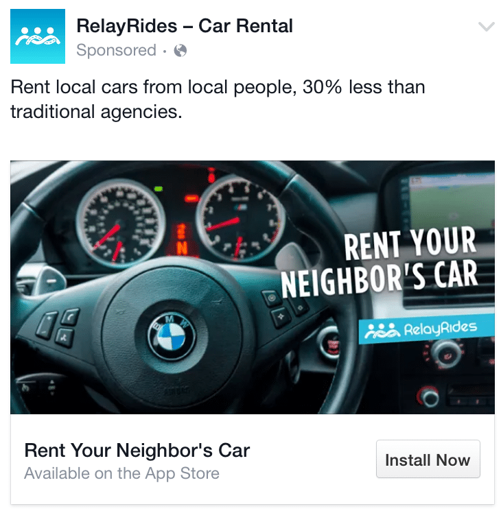
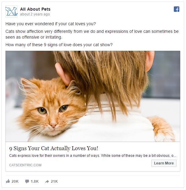
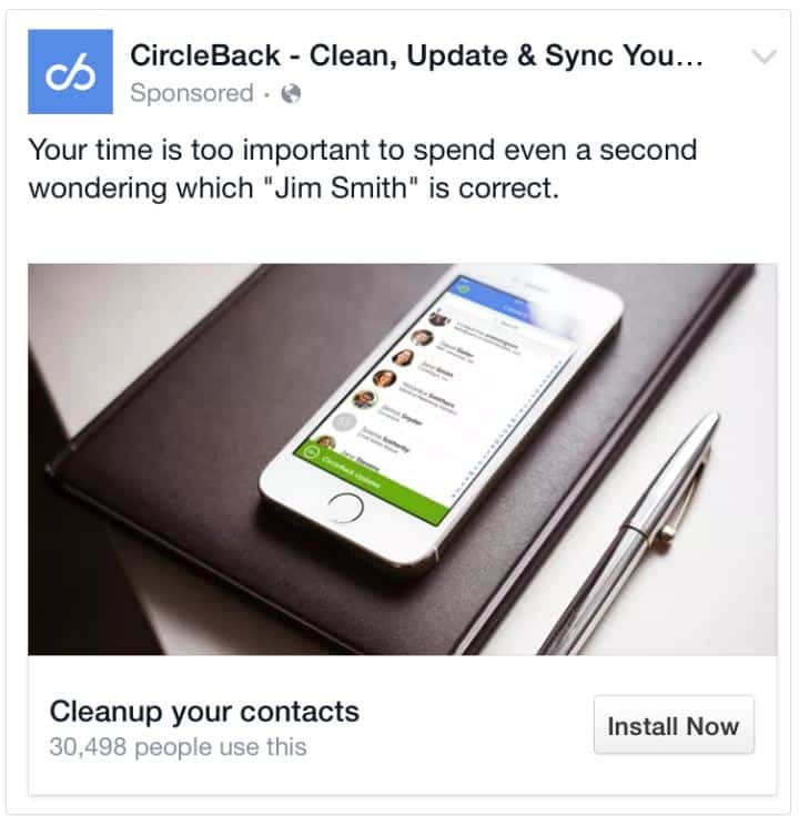
Check the following examples to get it right:
Why does this sort of attention-grabbing text work so well? Because it’s personal!
These texts respond to the user’s needs and make them wanna get this cool product.
Why?
Because this headline is tailor-made and customized to satisfy and respond to the user’s secret needs and eager wishes!
2. Innovate
If you’re working with a theme/category that’s already being covered by your competitors, make sure to bring some new weapons to the Battle Royale!
Use your headline to introduce that sweet novelty to the users. That’ll be the decisive factor that makes you get that classy cash!
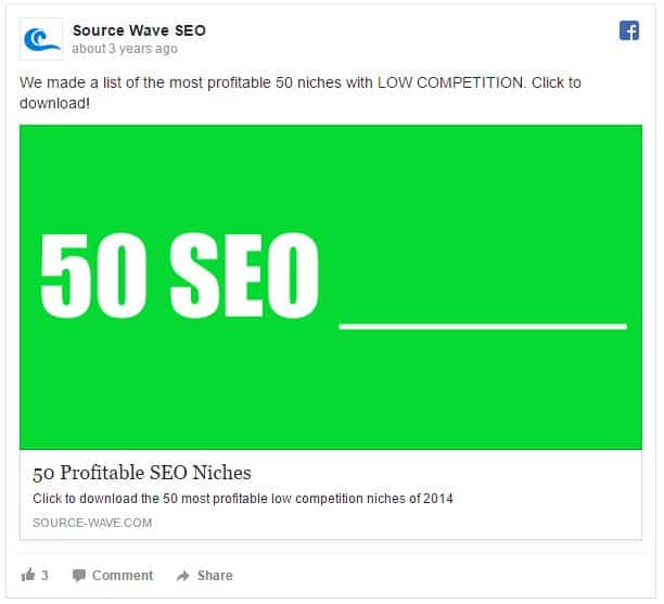
This next example really stands for innovation. From the millions of SEO niches available, they’re promoting 50 that’ll be profitable for the user.
This ad was a cool example of an original headline that creates expectations which fuel the user’s desires. This is the kind of copy that leads them to think: what the hell am I doing wrong?
I’ve gotta click to discover! I can’t resist it!
The post is so good that we’re gonna use it as a launchpad to remind you of an important detail which you’ve gotta implement in your titles:
Inspire curiosity!
Teasing the users with info they don’t know will ultimately create the need to find out and that’s when users decide to start learning new info.
Choose ad headers that tease the user’s brain such as:
“Here is everything you need to know before your trip to Portugal”
“These 2 simple things will inspire you to have a healthy life”
So how do you to inspire curiosity?
After reading the examples above, you must be thinking: “what do they all have in common?”
You’re right!
They tend to bear the theme in mind. The fellows who wrote the copy know what’ll make the user click!
3. Be Clear
The number of new posts rolling on Facebook is out of this world. With this much info passing through the user’s eyes, your message has to be crystal clear.
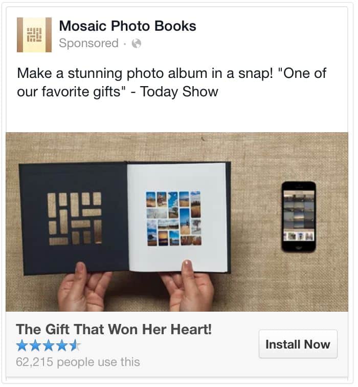
Whenever possible, make sure your headline specifies WHAT you want the user to do, WHY they should do it, and what’s the BENEFIT for them.
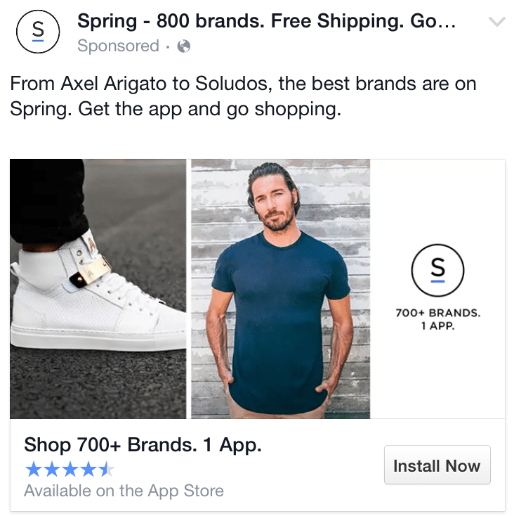
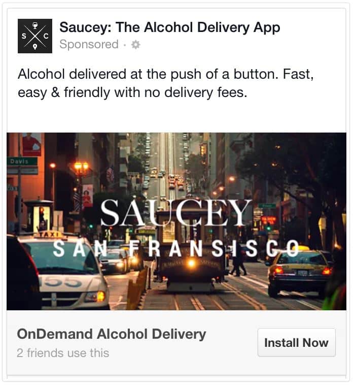
These examples will allow you to quickly understand what the benefit is to the user, and what they’ve gotta do to get it.
Make sure your message is as clear as humanly possible.
Keep it short and simple!
No one has the time or the patience to sit and read a long and vague headline, spending precious seconds deciphering what it’s all about.
Keep it simple, short, and precise!
For instance, you can say:
“Buy 2 for the price of 1 in the Summer collection”
Instead of:
“We have a special offer for you in the Summer collection, where you can buy 2 for the price of 1”
Bear in mind that you’ve gotta go straight to the point. Send your message across as directly as possible.
While doing that, you can always showcase your advantages:
List a Benefit
You should manage to list your benefit in a clear way. You really wanna avoid hesitation.
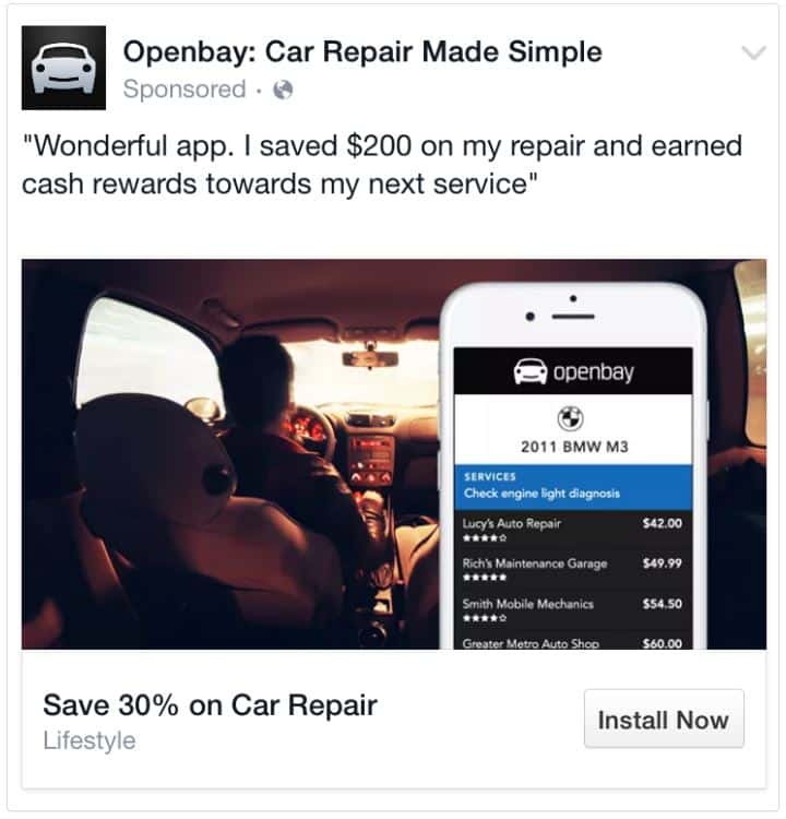
This is another strong technique for Facebook Ad titles, showing users how the offer benefits them.
For instance, giving the user the option to earn something if they subscribe to the offer is one of the best techniques to incentivize clicks.
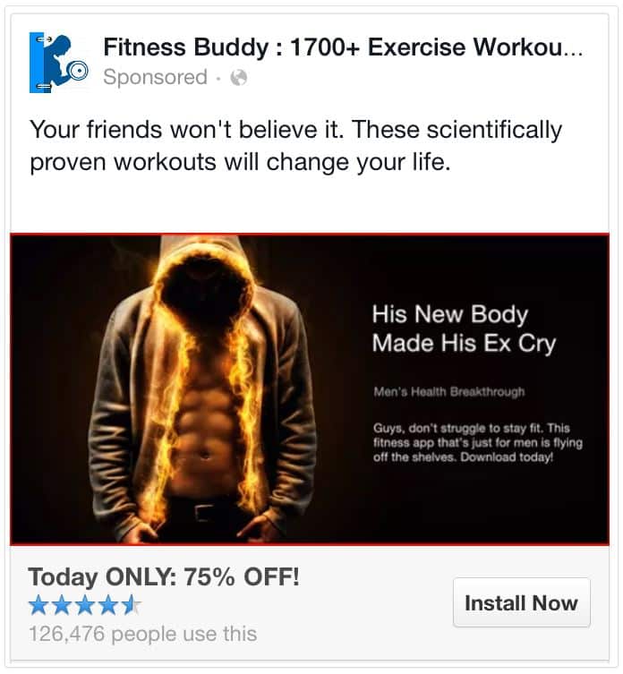
Here’s an example you should check in case your offer is related to health and fitness.
You can easily see how you could state something along the lines of “Lose 10 pounds in less than a month for 100 Euros only.”
That’s how you draw the attention of all those people looking to lose some bothersome kilos!
Normally, when you’re listing a benefit, the trick is to mention a discount or an easier way to do something. Check what’s out there and make it better!
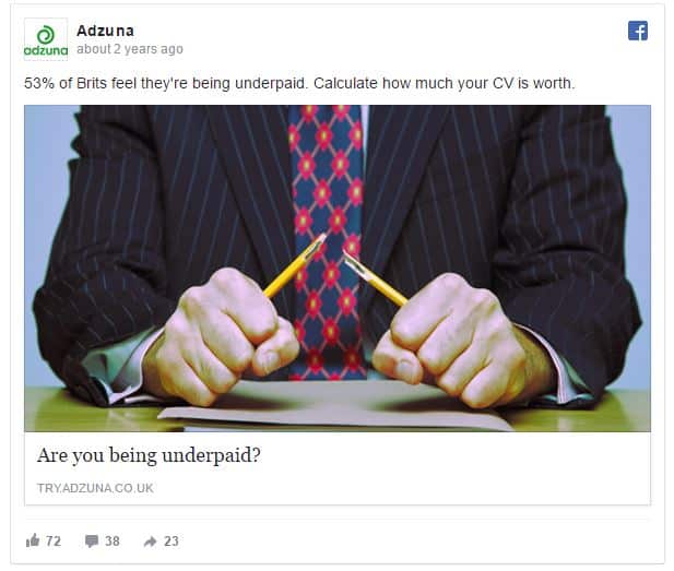
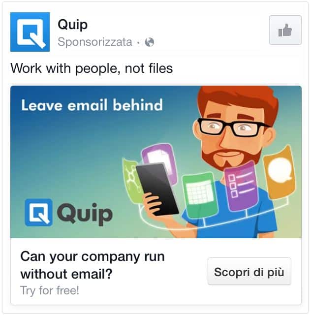
4. Ask a Question
These texts shouldn’t just make a statement – they should start a conversation. Begin the dialogue by posing a question to your readers.
Several studies have shown that – by asking a question – you actually grab the user’s attention, since you’re “forcing” them to find an answer.
These types of headlines created as questions get 150% more clicks than statement titles.
Questions appeal to reader’s emotions like nothing else. They really make readers want to know more.
Example: Are You Making These 11 Mistakes at Work, Too?
It doesn’t sell a fancy product. It doesn’t claim: “you won’t believe what happens next!”
It simply starts a conversation, and lets the readers do the rest.
A great question headline is short, clear and must entice and burn people’s curiosity.
Think of what your user is looking for and ask a question which will make them crazy to find the answer to.
5. Be Concise
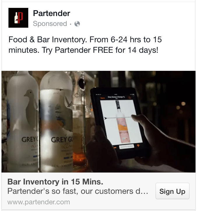
Make it short. If you manage to create a headline that’s concise, you’ll be playing to win!
Do you know what that means?
You’ve just created the perfect headline!
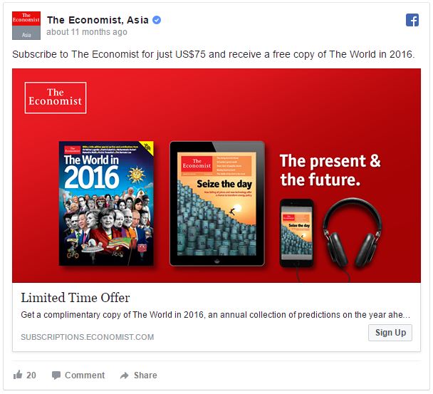
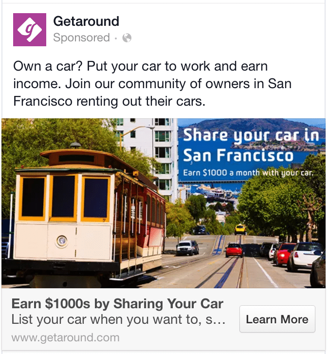
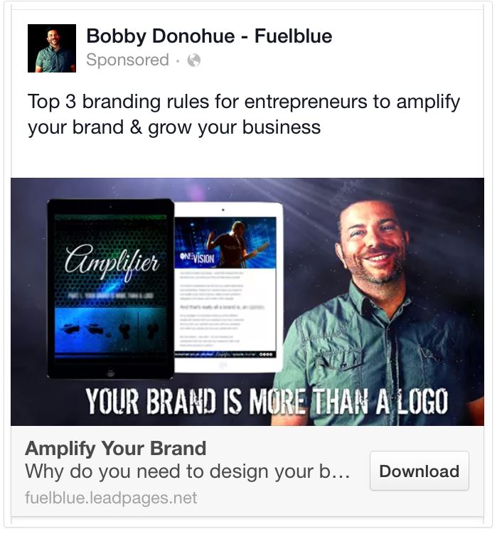
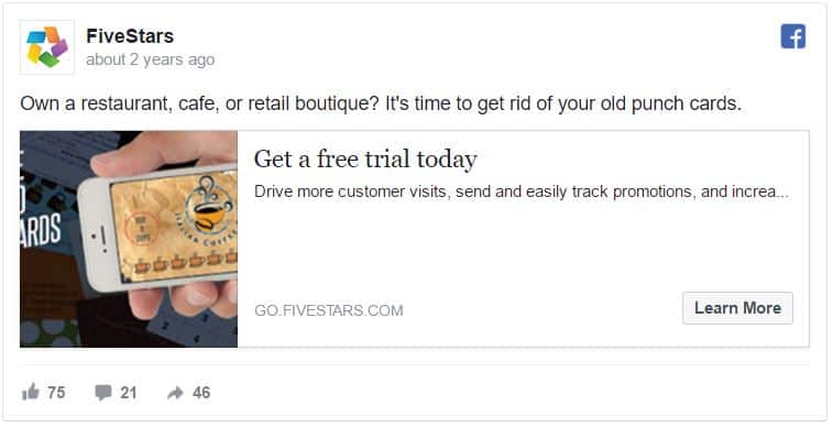
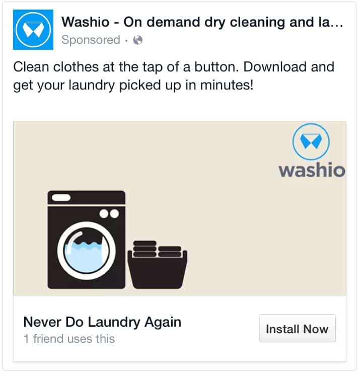
Take a look at some examples:
Bonus Topic: The Call-to-Action Button
A clear and concise headline should always be accompanied by the correct Call-to-Action button (CTA).
Call-to-Actions are generally used in marketing as instructions to your audience designed to instigate an immediate response. They normally are all about using an imperative verb such as “learn more”, “start now”, “sign up”
Without a clear CTA button, you’re abandoning your visitor.
Why?
Because they don’t know what they’re supposed to do next. Don’t do that, bro!
Add a sense of urgency to your button so as to increase that amazing CTR. Go for texts like “Buy Now & Get 20% Off” or “Free Trial Offer Ends Today.”
Here are some of the more used Call-to-Action words that you definitely need to take into account to make it rain like it’s insane:
Verbs: Learn, Find, Discover, Start, Stop, Join, Get
How do you make sure your Call-to-Action conveys the sense of urgency that demands a user’s attention?
Use these phenomenal words, that’s how!
Now, Today, Before, Ends, Hurry
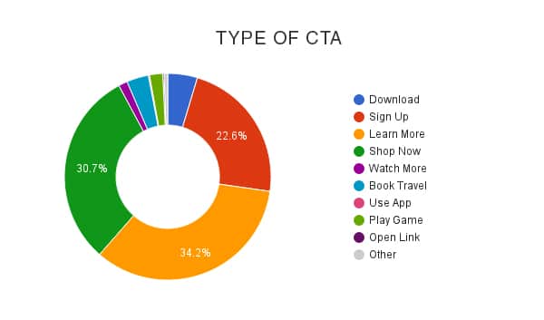
Take a look at which Call-to-Action buttons work best in Lead Generation Ads:
Source: Adespresso
The general rule is that your CTA button should match the ad’s goal. If you want the user to sign up, use the “sign up” Call-to-Action. If you’re earning per download, use the “download” Call-to-Action, etc.
In the end, it’s all about how you engage the user, making them yearn for your ad.
Never forget the rules these two lords have provided: make it simple, give an order, and make sure your headline matches whatever it is you’re promoting!
Conclusion
The overall goal is to engage the user and make them subscribe to your offer, right?
If you follow these steps, you’ll get closer to achieving that. The golden rule is to really know your audience and make your headline pop like neon to make sure you make that brass with unbelievably cool class!
Remember: there are a whole lotta Facebook posts out there polluting the social
network.
network.
Your task?
To be concise, write effectively, and be able to charm and engage so as to lure users in and make that capital run free, filling your pockets with hard-earned gold!
Never stop testing! Keep it up and we guarantee your advertising efforts will earn you the cash you deserve.


No hay comentarios.:
Publicar un comentario